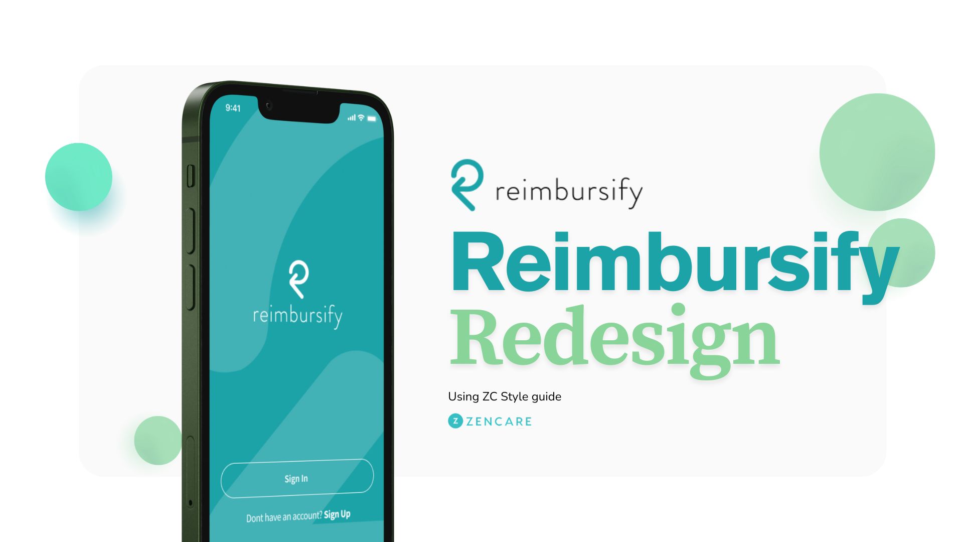
Overhauled the Reimbursify mobile app's visual assets and app store presence.
Client
OPS
Year
2025
Role
UX/UI Design ,User Research, Interaction Design
Problem Statement
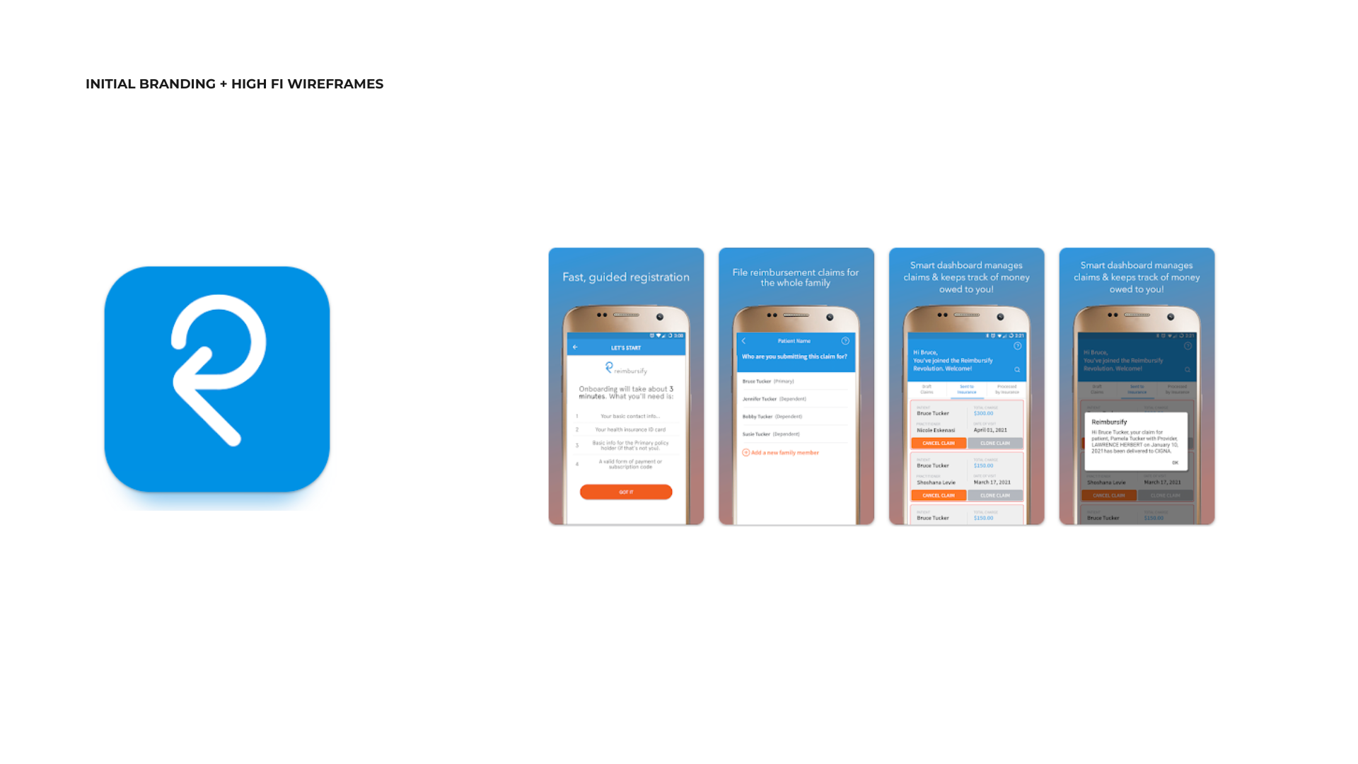
Following the Zencare brand redesign, the Reimbursify mobile app felt like a legacy product. Its presence on the Google Play and Apple App Stores was inconsistent with the new "Unified Care" aesthetic, creating a disjointed experience for therapists and clients moving between platforms. The existing assets failed to communicate the app's modern, streamlined value proposition.
Project Overview
This project involved a comprehensive visual overhaul of the Reimbursify app’s store presence and key in-app interface mockups. The goal was to align the mobile experience with the new Zencare brand guidelines while optimizing for App Store Optimization (ASO) to drive downloads and user trust.
a
Research and Discovery
Understanding the Problem:
Brand Fragmentation: Users were moving from a modern Zencare web interface to an outdated-looking mobile app, leading to "brand whiplash."
Feature Clarity: Existing screenshots were text-heavy and didn't immediately show the app’s primary value: submitting claims in seconds.
Visual Trust: In the healthcare space, visual polish is directly tied to the user's perception of security and HIPAA compliance.
User Research:I audited the existing sign-up journeys and store reviews. A common theme was the desire for a "seamless" connection between their practice management software and their reimbursement tools.
Competitive Analysis:I evaluated competitors like SimplePractice and BetterHelp to see how they maintained a cohesive brand identity across secondary utility apps. I identified a trend toward "lifestyle-integrated" screenshots, showing the app being used in real-world contexts.
Design Thinking Process
Ideation and Brainstorming:We focused on three core pillars for the new visual direction:
Simplicity: Minimalist device frames to keep the focus on the UI.
Speed: Using bold headlines that highlight the "claims in seconds" workflow.
Cohesion: Utilizing the Zencare palette (teals, golds, and soft neutrals) to anchor the app within the ecosystem.
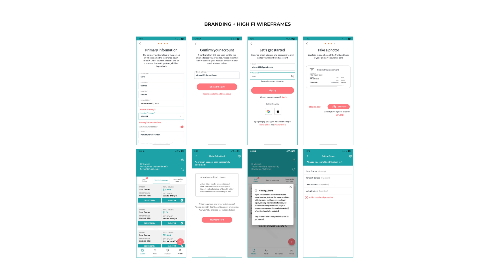
Prototyping:I created high-fidelity mockups in Figma, experimenting with different layouts for the App Store "Feature Graphic." I iterated on the "Empty State" screens to ensure that even when a user first logs in, the branding feels premium and welcoming.
Solution Implementation
Visual Redesign:
Device Framing: I developed a set of high-fidelity device mockups (iPhone 15 and Pixel 8) that utilized the new Zencare color palette.
Marketing Imagery: I designed a series of 10+ screenshots for both iOS and Android, each focusing on a single "Job to be Done" (e.g., Tracking Payouts, Adding a Provider).
Asset Creation:
Figma Design: Developed the master template for all app store assets, allowing for quick updates if the UI changes in the future.
High-Fidelity Rendering: Used advanced design tools to generate "lifestyle" imagery that showed the app in a professional therapeutic setting.
ASO Compliance: Ensured all assets met the strict resolution and safe-zone requirements for the Apple App Store and Google Play Store.
Conclusion
Results and Impact:
Unified Brand Identity: Successfully launched a cohesive visual presence that aligns Reimbursify with the broader Owl Practice and Zencare ecosystem.
Improved User Perception: Feedback from the Sales and Success teams indicated that the new visuals provided a more "professional" and "trustworthy" feel during the therapist onboarding process.
Marketing Readiness: The new assets are now used across the Hubspot CRM and marketing landing pages, providing a consistent look for all lead-generation efforts.
Future Enhancements:
A/B Testing: Implementing Google Play Store experiments to see which feature-focus (e.g., "Fast Claims" vs "Easy Tracking") leads to higher conversion.
Video Previews: Developing short, brand-aligned motion graphics to act as "App Previews" on the store listings.